
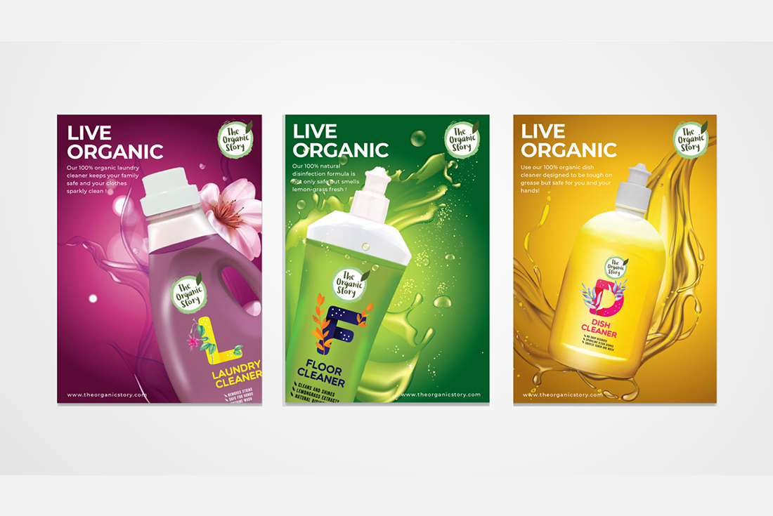
Overview
The idea was to represent the brand is
made of the finest organic ingredients.
This brand needed to convey the purity
of the intent (and ingredients) they put
into these products.
The circle with a grunge feel and the
leaf over it makes it look raw, natural
and organic supported by shades of
green. The fonts used are not very
serious and have a raw fresh effect to it.
Clean, minimal, and clutter-breaking
yet colourful pack labels were designed
to make an impact on the retail shelves.
She packed her seven versalia, put her initial into the belt and made herself on the way. When she reached the first hills of the Italic Mountains, she had a last view back on the skyline of her hometown Bookmarksgrove, the headline of Alphabet Village and the subline of her own road, the Line Lane. Pityful a rethoric question ran over her cheek, then she continued her way. On her way she met a copy.
Project
Branding
Client
Touch A Life
What We Did
Logo Design, Brand Identity Design, Brochure Design
